Introduction to Design Prompt Engineering
Introduction
Kombai is an ensemble of deep learning and heuristics models trained to understand designs like humans. Developers can prompt Kombai with design files in their Figma and get high-quality React and HTML + CSS code in just one click per component.
Kombai doesn't require any pre-processing, such as tagging/ grouping/ naming the elements or using auto-layout, either in Figma or in the product itself. Instead, it tries its best to imitate the logical grouping of elements in the design to form a logical div structure. It also tries to give minimum hardcoded widths and margins to position these divs and tries to guess which elements may grow and shrink.
Interestingly, there are often tens, if not hundreds, of different div-structure and styles combinations that can be used to code a particular UI design. During our private-research-preview phase, developers have seen Kombai generate high-quality, logically structured code in general. But at times, it may interpret designs in ways that may differ from how a particular developer would like to structure their code. In such cases, it may be possible to tweak your design in small ways to nudge the model to write the code in your preferred way. This process can be thought to be very similar to “engineering” text prompts to an LLM like ChatGPT or Claude. Hence, we call this process “Design Prompt Engineering.”
In this guide, we provide a few examples of how a user can engineer their ‘design prompt', i.e., make minor tweaks in their designs to nudge the model. Please note:
-
because of the generative nature of the model and ongoing improvements to it, the exact code you'd get from Kombai for these designs may vary over time. But the principles we describe here should generally hold true and are worth a try if you are facing similar challenges.
-
in the examples, we've used screenshots of either the HTML/ CSS code or the React code. Both of these code outputs in Kombai use similar code structures. If you want to check the code output, please use the Kombai links inside relevant sections to open up the design in Kombai, and select the relevant tabs on the bottom pane.
Examples
1. Add a line to tell Kombai about a section division.
In some cases, particularly when there is no visible separator between sections, Kombai may not group elements into logical sections.
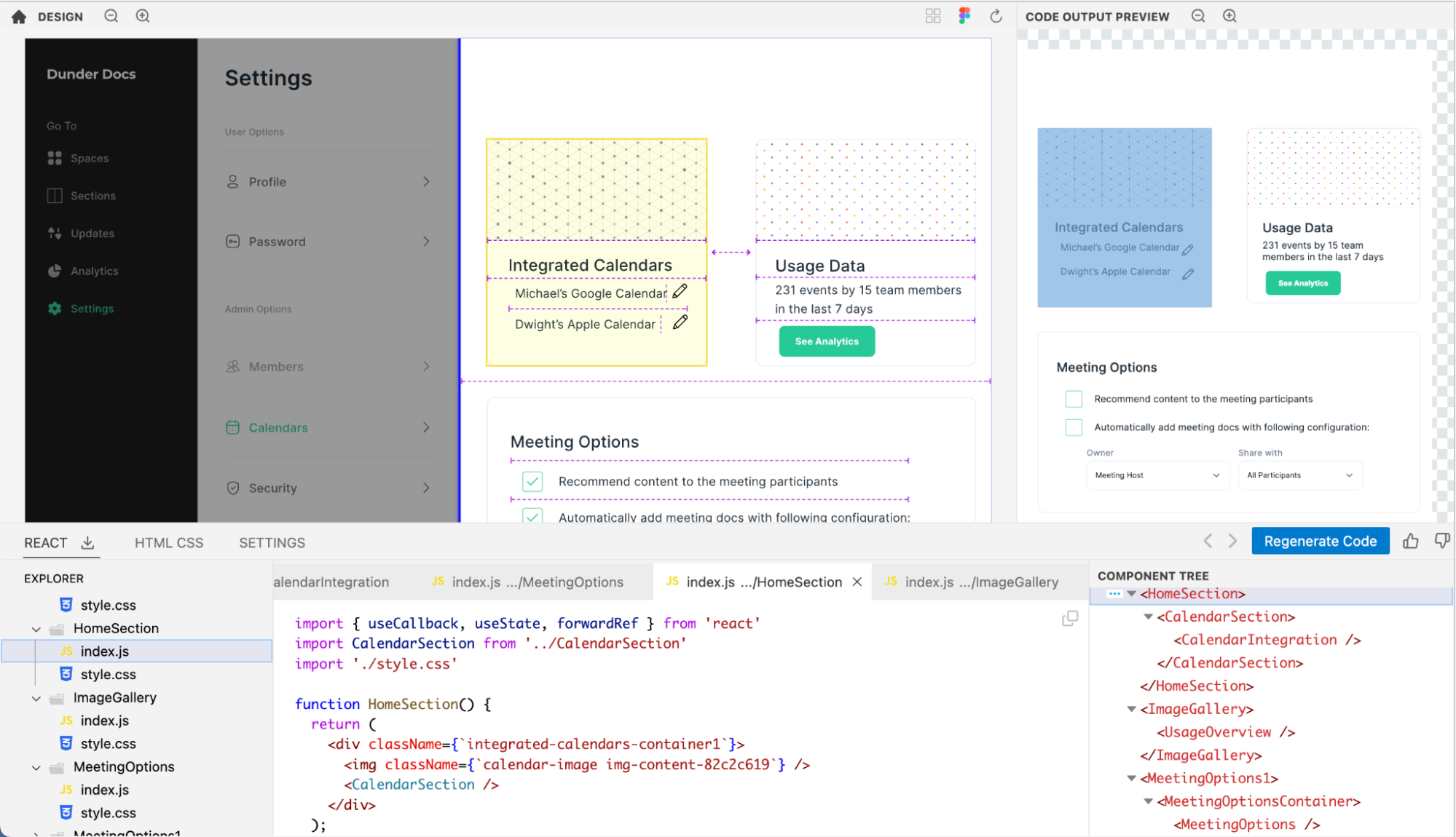
For example, let's consider this card (opens in a new tab)

Kombai splits this design into two vertical sections and groups both buttons at the bottom, as well as the number of students and rating texts above it together. (Open design in Kombai) (opens in a new tab)
However, from the lens of a developer, this grouping may look a little unnatural. Many developers would want a separate section for the sidebar and the rest of the page. To nudge Kombai to interpret the sidebar as a separate column , we can add a line divider just next to it. Below is the redesigned Figma with this change Figma Link (opens in a new tab)
With this change, Kombai interprets the two sections of the page separately and creates two distinct selectable components with code structures within them. Kombai Link (opens in a new tab)
Now remove the sidebar div to get the code which matches your original design.
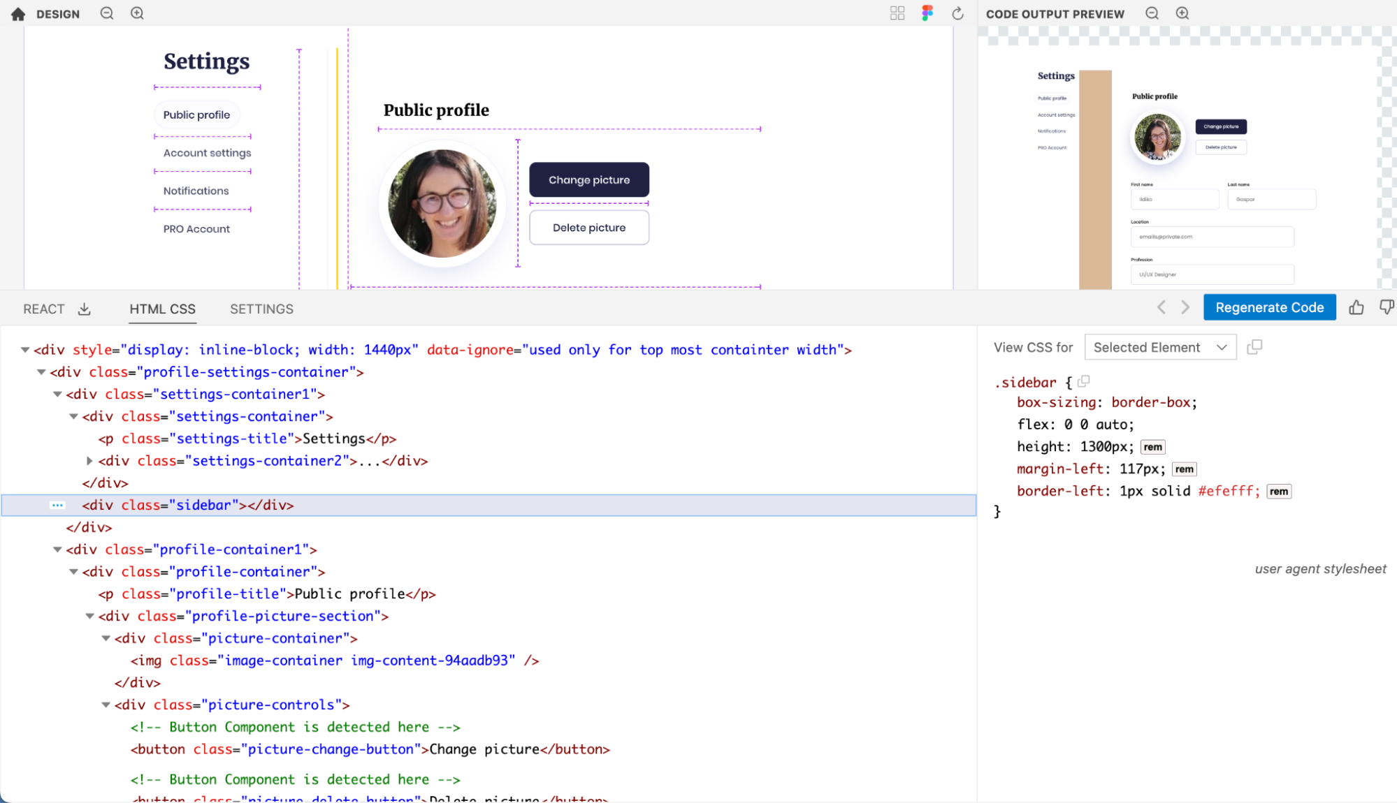
2. Add a box to group elements of a section together.
In some cases, Kombai may not be able to group elements into logical divs without visible box boundaries.
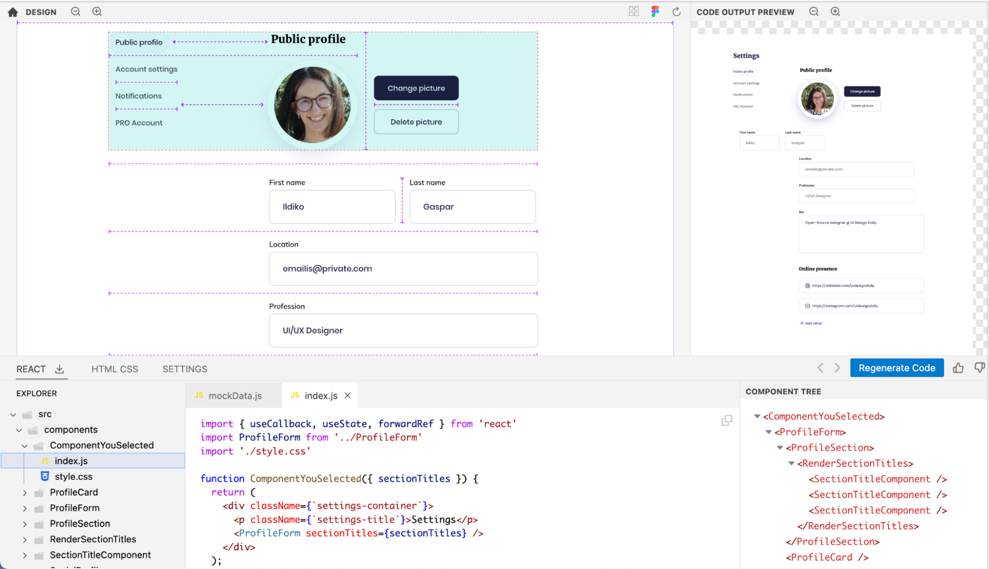
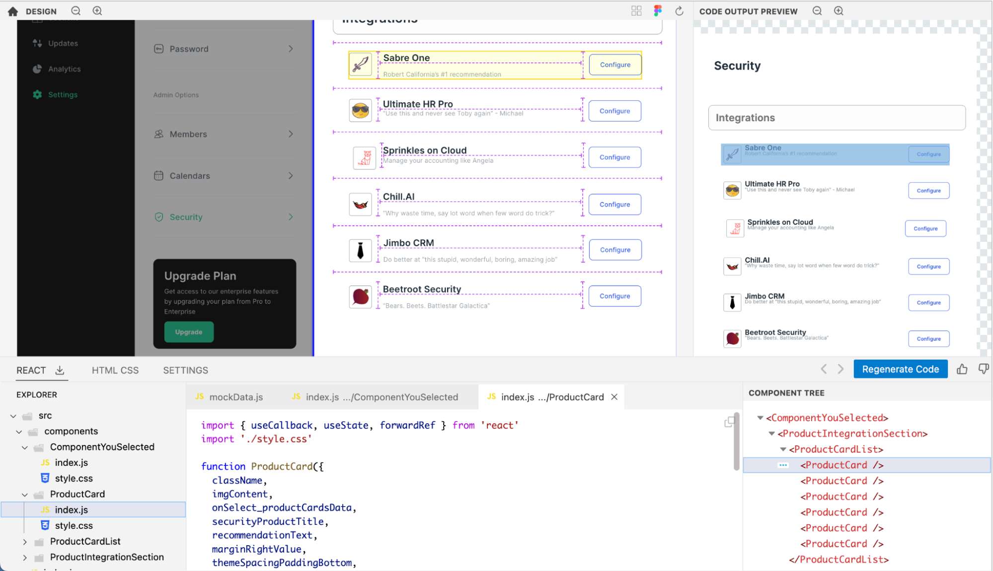
For example, let's consider this example of a page within a SaaS app's settings section Link to Figma File (opens in a new tab). You'd notice that although it'd perhaps be natural to divide the section on the right of the “settings” menu into three cards, there are no visible boundaries of these cards in the design. (This probably doesn't look like the most natural design choice. But who are we to judge the creative freedoms of design folks? 🥲)
Kombai produces a code output that looks very similar to the design prompt. But, the div structure of the code looks somewhat unnatural. Because it cannot deduce the boxes with high confidence, and most of the elements seem to be aligned in rows, it ends up splitting the content into various rows. Open Design in Kombai (opens in a new tab)
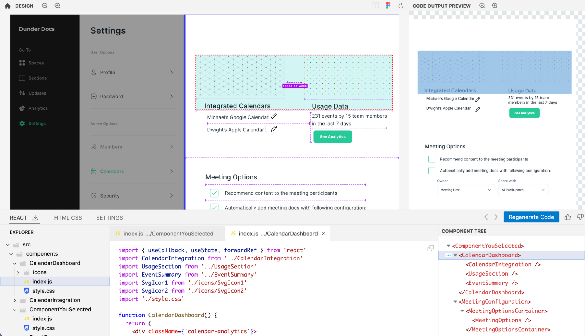
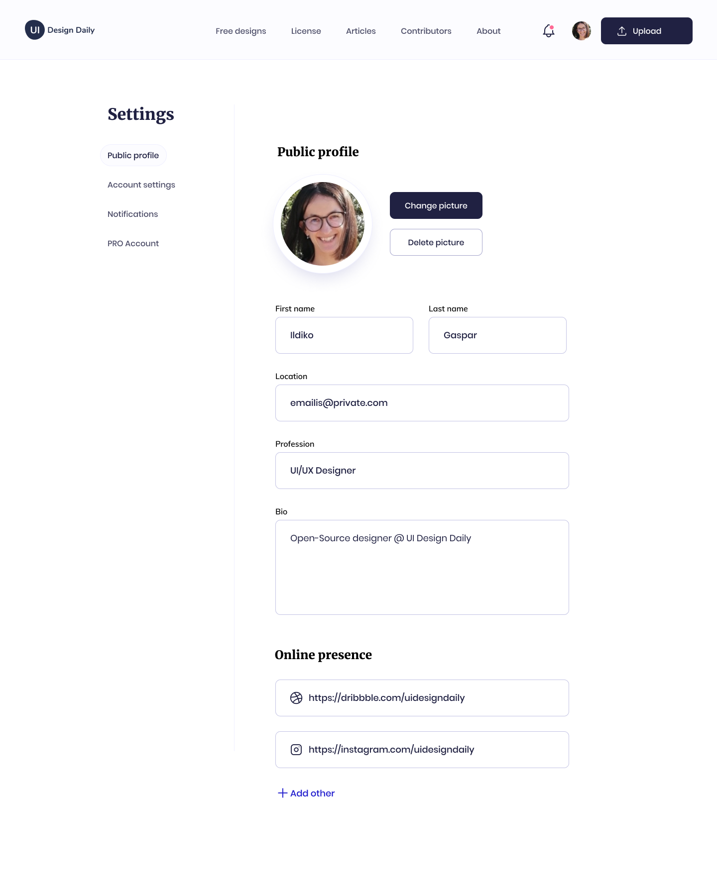
However, you can nudge Kombai in the right direction by just creating the boxes you'd consider natural. See below for the updated design. View Figma File (opens in a new tab). Note:
- the elements within these boxes were not grouped in this design. The only change we made from the previous design was to introduce these 3 boxes with thin borders.
- once you get the code from Kombai for this in the next step, you can easily remove the CSS for the box borders in your code.
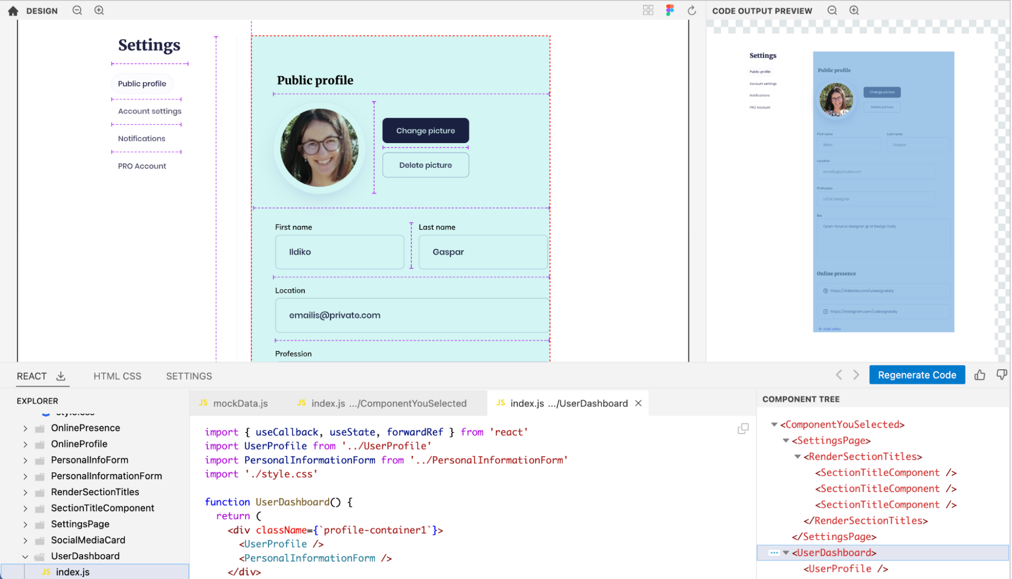
Taking cues from these invisible boxes, Kombai is now able to divide the code into three logical cards, with the top two of them arranged in one row. Open Design in Kombai (opens in a new tab)
Once you copy/ download the code into your IDE, you can easily remove the border-related CSS from the divs for these 3 boxes to make the code output look exactly like the initial design.
3. Adjust the spacing between elements to reflect the true intention of the design
Although Kombai tries to interpret designs like humans and has built-in tolerance for interpreting dimensions and spacing, it can struggle with some deviations in design that might not look too off to experienced developers & designers. This can happen with spacing between elements as well as alignments of elements against an axis or relative to each other.
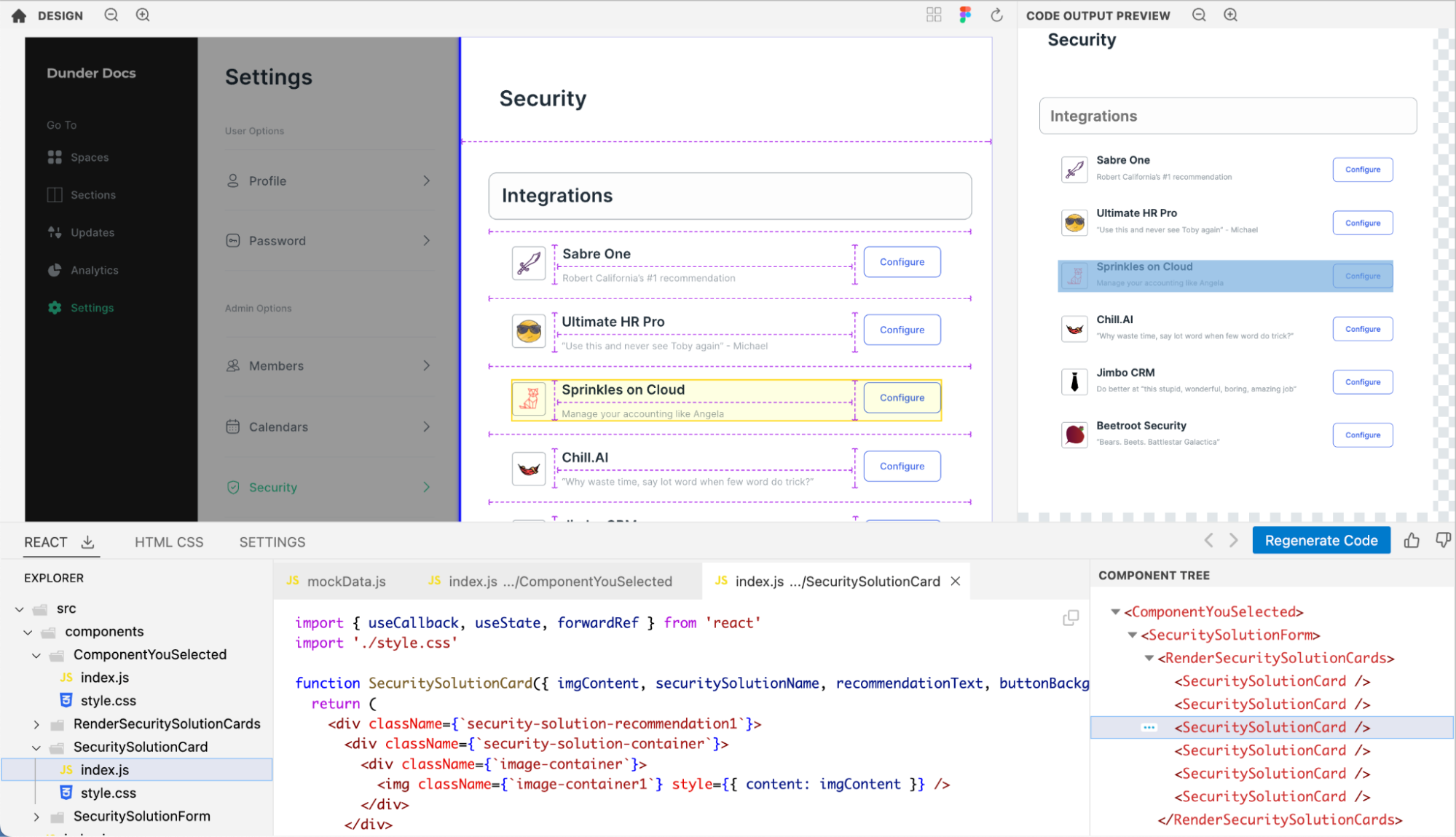
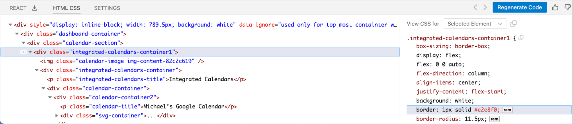
For example, in this design, the gap between the header and subtext of the rows (e.g., that between “Sabre one” and “Robert California's #1 recommendation”) is uniform in all rows but row 2 and 3. View Figma File (opens in a new tab)

While Kombai is still able to figure out that all of the rows should be built using the same component, its alignment of the elements inside the rows looks a little off. An experienced human developer would probably be able to figure out the right spacing between the header and subtext that would look natural in the product. But unfortunately, there is not enough context available to Kombai to make that decision accurately. Open File in Kombai (opens in a new tab)
To make the right spacing obvious to Kombai, you can modify the spacing in rows 2 and 3 to make it similar to the other rows, which is probably the natural intention of this design anyway. Note - the gaps do not have to be exactly the same, but similar enough not to throw off Kombai. View Figma File (opens in a new tab)
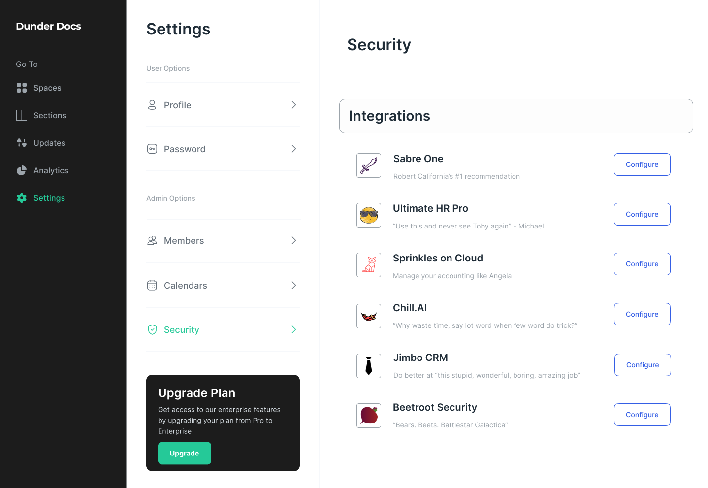
With this change, Kombai can now identify all the spacing correctly and produce accurate flex & spacing-related CSS that looks natural. Open File in Kombai (opens in a new tab)